[Week 3] Notes on Conducting UX Research and Testing Early Concepts
Course 4 of 7 Google's UX Design Professional Certificate by Coursera
In continuation with the Research notes of the usability study of last week, we will now analyze the notes and synthesize valuable insights from the same.
Week 3: Analyzing and Synthesizing Research Results
Observations to Insights
When you synthesize something, you combine ideas to draw conclusions. In UX design, we group data into themes. We want to find insights that evolve our understanding of users and their needs. After we discover insights, we will iterate on our design to make it better.
UX design is all about coming up with an idea, getting feedback from participants or users, and iterating to make the idea better.
An insight is an observation about people that helps you understand the user or their needs from a new perspective.
Broadly, this process consists of four parts:
Gather the data (from usability study notes, other researchers, etc.)
Organize the data (affinity diagramming, spreadsheets, etc.)
Find themes in the data
Synthesize an insight for each theme
Case Study: Google Maps
Problem: In large, densely populated cities like Delhi (India) or Jakarta (Indonesia), traffic is a real headache. Mapping applications like Google Maps were built for cars, so once you are stuck, there is no other option but to wait.
Solution: Locals use two-wheeled vehicles like bikes or motorcycles as a way around this obstacle.
Design Problem: A moped driver doesn't have the same ability to use Google Maps as they cannot see or listen to the directions easily while driving, because of various reasons such as wearing a helmet, loud periphery, risk of getting distracted, etc.
Methodology: The team of UX designers and researchers traveled to the region to meet with locals. They interacted with locals in traffic, in their homes, and even on the backs of their motorcycles.
The team valued the immersive experience of actually riding through traffic and experiencing the bugs in the Google Maps app in real time.
This kind of research is called field research as compared to traditional research, like asking riders to test a new app feature and collecting feedback, and compiling data.
Design Solution (Insights):
Since it's difficult to follow a map while driving a two-wheeler vehicle, drivers tend to memorize the route beforehand. So the google maps instructions were made more glanceable and memorable.
More landmark references were added for the same reason.
Additional language options were provided in the app so that the driver would more likely understand the map's directions.
Routes were optimized for two-wheeler vehicles in the two-wheeler mode, taking shortcuts through narrow alleys and roads that a car can't travel through
Affinity Diagrams
An affinity is a feeling of like-mindedness or compatibility towards something or someone. An affinity diagram is a method of synthesizing that organizes data into
groups with common themes or relationships.
Tips for creating affinity diagrams:
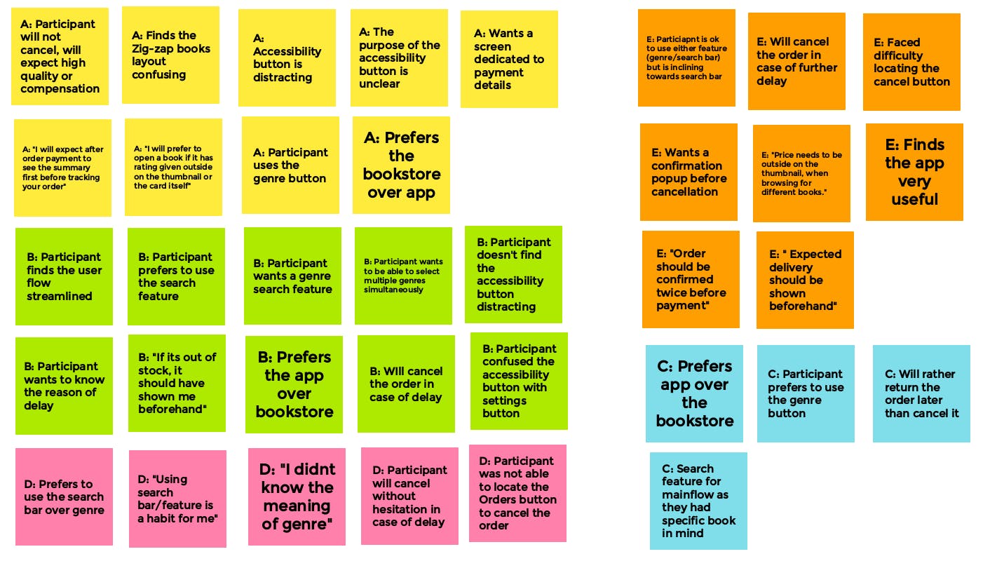
Each sticky note lists a single idea, observation, or direct quote from a participant
Differentiate each participant using unique colors for their notes
The information on each sticky note should be no longer than one sentence and the sentence should make sense without explanation so that it’s easy for everyone to understand quickly.
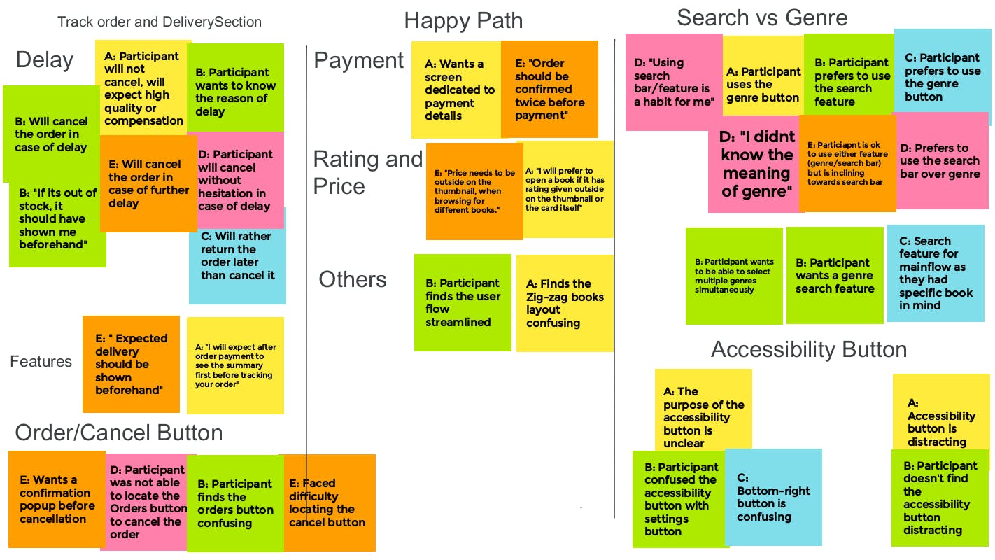
Group each sticky note with similar ideas or problems together. This cluster is a pattern you observed in the user data.
Consider creating a few category names beforehand to help get the sorting started. For webpages, some common categories are: Search, Global Navigation, Homepage, Legibility, Footer, and Page layout. Stick these category names high on a blank part of a wall, so many notes can fit below.
Themes and Insights
Themes:
Patterns identified in the affinity diagram are converted into themes.
To find themes in the data, we will ask ourselves two simple questions. What common patterns have you identified in the data that you've collected and what did they tell you about the product design?
Limit themes to just one idea and remove opinions from the process and ensure that your themes are based on objective observations you made.
Example: It was observed that 4 out of 5 participants had trouble finding the 3 dot sub-menu. This means that the 3 dot sub-menu is difficult to find for almost all users.
Insights:
Insights need to answer the research questions you listed in your research plan.
Insight should increase empathy for the user experience.
Strong insights inspire direct action. For example, an insight that states, "The dog walker app is useful" does not suggest an action. But an insight that states
"Users want to book a dog walker on a scheduled basis instead of making a one-time reservation," tells the team that this part of the user experience needs to be adjusted.
Example: Based on the theme that: the 3 dot sub-menu is difficult to find for almost all users, an insight is: users need a more intuitive way to access settings.
Submission
Unsorted Affinity Diagram

Sorted Affinity Diagram with themes

Themes and Insights
Drawing themes from the affinity map and creating actionable insights from the themes.
![[Week 3] Notes on Conducting UX Research and Testing Early Concepts](https://cdn.hashnode.com/res/hashnode/image/upload/v1674327412351/fcc11d2e-9ee4-4adc-837e-e26da564eaf4.png?w=1600&h=840&fit=crop&crop=entropy&auto=compress,format&format=webp)