[Week 2] Notes on Building Wireframes and Low-Fidelity Prototypes
Course 3 of 7 Google's UX Design Professional Certificate by Coursera
In Course 3 Week 2 we are introduced to Figma. Keeping in mind the purpose of these blog series (to create a revision material for the UXD course), brevity is of the essence hence I decide to not include the step-by-step process of creating a wireframe using Figma here (and won't be including it in any of the upcoming posts either 🙂).
I'm sure there are much better resources on such UI aspects and on Figma as a design tool, one of them being the official Figma docs and Figma's Youtube channel.
Week 2: Creating Paper and Digital Wireframes
Basics of Information Architecture (IA)
Information architecture, or IA, organizes content to help users understand where they are in a product and where the information they want is. We use information architecture to help us organize content so that it’s easier to understand, navigate around, and get stuff done.
Information architecture is made up of three pieces:
Organization: The organization is how different pieces of information connect in a product.
Hierarchy: The hierarchy is often called the “tree structure” and is where a larger category is placed at the top and specific categories related to the overall category are placed underneath. Peer information is placed side by side (or on the same level as each other).
Sequence: The sequence enables users to move through an app via certain orders or steps.
There are eight basic principles of information architecture created by the founder of EightShapes, Dan Brown.
Object principle: You should view your content as “living” and as something that changes and grows over time.
Choice principle: People think they want to have many choices, but they actually need fewer choices that are well-organized.
Disclosure principle: Information should not be unexpected or unnecessary.
Exemplar principle: Humans put things into categories and group different concepts together.
Front door principle: People will usually arrive at a homepage from another website.
Multiple classification principle: People have different ways of searching for information.
Focused navigation principle: There must be a strategy and logic behind the way navigation menus are designed.
Growth principle: The amount of content in a design will grow over time.
Sitemaps
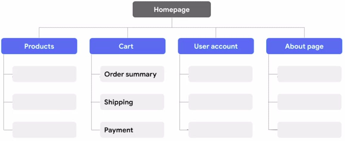
Information architecture is visually represented through sitemaps. This hierarchical connection between content is often referred to in the UX field as a “parent/child” connection.
A detailed sitemap contains seven key deliverables.
High-level App Features. Key features of the product.
Required Screens. The pages and popups are presented to the user.
Page Paths. The web address (URL) of the page.
Page Functions. Page expectations.
Calls to Action. The desired user behavior.
User Flow. The user’s movement.
Cruxes. Potential hangups or complexity.
- Sitemap Example:

Creating Wireframes
There is no specific way when it comes to creating wireframes. But the general outline and some points to keep in mind during the process are:
The goal of creating a wireframe is to establish the basic structure of a page and to highlight the intended function of each element.
We do not want to focus on visual elements like color or fonts at this point.
We may want to start with creating wireframes on paper first before creating their digital counterparts.
Before we begin drawing, it's helpful to write a quick list of the information that needs to go on the page you're drawing wireframes for. Example: Navigation icon, search bar, images, text descriptions, etc.
It's a good rule of thumb to try to create at least 5 different versions of how you want to structure information on a page (5 different versions of each screen in your product such as homepage, cart, payment, and so on).
We can pick the wireframe to replicate its digital twin from these five or merge the best features from each into a 6th wireframe.
Use actual content for important pieces of text instead of all placeholders. Use "Lorem ipsum" for others.
Before transitioning to digital wireframe, ask yourself these 3 questions about your final wireframe:
Is my paper wireframe complete?
Have I received feedback on my paper wireframe?
Am I ready to consider basic visual cues?
- When you are ready to move on, replicate your paper wireframe in the design software of your choice.
Gestalt Principles
The human brain makes sense of the world around it by building logic, patterns, and structure. Gestalt Principles describe how humans group similar elements, recognize patterns, and simplify complex images when we perceive objects.
We can apply Gestalt Principles in wireframes to organize content so it is visually pleasing and easier to understand.
Gestalt principles got their name from the word Gestalt, which is a German word that means shape or form.
Three of the Gestalt principles(Out of 7) are:
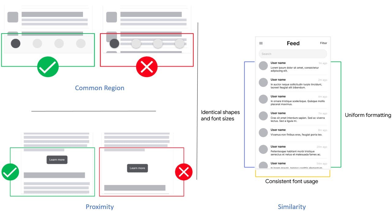
Similarity means that elements that look alike (in shape, size, or color, for instance) are perceived to have the same function.
Proximity means that elements that are close together appear to be more related than things that are spaced farther apart.
Common region means that elements located within the same closed area are perceived to be grouped together.
Similarity
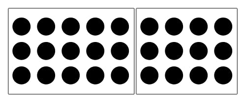
Various design elements, like color and organization, can be used to establish similar groups. In the image below, for example, even though all of the shapes are the same, it’s clear that each column represents a distinct group:

Source: Andy Rutledge
Proximity
Proximity is so powerful that it overrides the similarity of color, shape, and other factors that might differentiate a group of objects.

Source: Steven Bradley
Notice the three groups of black and red dots above? The relative nearness of the objects has an even stronger influence on grouping than color does.
Common Region
Adding borders or other visible barriers is a great way to create a perceived separation between groups of objects—even if they have the same proximity, shape, size, color, etc.

Source: Smashing Magazine
Example of Using Gestalt Principles in a product

Check out my wireframe submission along with the paper wireframe snaps here. (Final Low-Fidelity Wireframes)
I was reluctant on creating 6 frames for each screen at first as it seemed like a lot of work 😝. I was happy with the first frame I created and couldn't see how to improve it. But to my surprise, on each iteration, I could see the shortcomings of the previous one, and before I knew it I created 15 frames in total. 😎
All in all, it was again refreshing to think from a designer's perspective trying to think from a user's POV. [insert Inception music🥸]
We'll continue the UX exploration by building these wireframes into prototypes next week.
![[Week 2] Notes on Building Wireframes and Low-Fidelity Prototypes](https://cdn.hashnode.com/res/hashnode/image/upload/v1672994713218/f6cd545e-c4fa-497c-bbc9-65d05605ecc6.png?w=1600&h=840&fit=crop&crop=entropy&auto=compress,format&format=webp)